Since scale labels play such an important part of producing a visually pleasing graph there are a number of ways to fine tune this appearance. In the section below we have tried to logically group the different options to make it easier to get an overview.
The exact position of the labels can be adjusted with the methods
-
Axis::SetLabelAlign($aHAlign,$aVAlign='top',$aParagraphAlign='left')With this method the anchor point for the labels can be adjusted. The labels are positioned straight below (or on the side for vertical axis) the corresponding tick mark and by adjusting the anchor point in the label different effect can be achieved. By default labels on the x-axis there anchor point on the top side in the center. For y-axis (on the left) the anchor point is middle of the right edge of the label.
-
Axis::SetLabelMargin($aMargin)This method adjusts the distance between the corresponding tick mark and the label it self.
-
Axis::SetLabelSide($aSidePos)This method will adjust on what side the labels will be positioned. For a horizontal axis it cna be either above or below the axis and for a vertical axis it can be on the left or right side. The position is defined by one of the following self-explaining defines
-
SIDE_LEFT -
SIDE_RIGHT -
SIDE_TOP -
SIDE_BOTTOM
-
By default the color of the labels will be the same as for the axis but it is
possible to use a different color for the labels by supplying a second argument
to the SetColor() method for the axis.
-
Axis::SetColor($aColor,$aLabelColor=false)There is actually a special twist to the color specification here. If the color is specified as a single value this color value will be used for all labels. However, if the color is specified with an array then those colors will be used for the labels in turn. If there are more labels then colors specified then the colors will be used in a wrap around fashion.
The font family for the labels can be specified with
-
Axis::SetFont($aFamily,$aStyle=FS_NORMAL,$aSize=10)
By default a bitmap font is used for the labels (since those are the only fonts guaranteed to be available everywhere)
Example 14.1. Adjusting the axis font and color
1 2 | $graph->xaxis->SetFont(FF_ARIAL,FS_NORMAL,9);
$graph->xaxis->SetColor('black','blue'); |
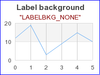
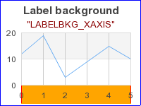
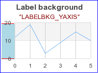
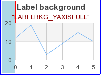
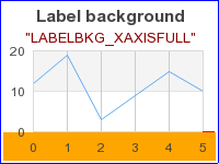
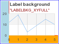
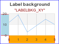
As a kind of a very special formatting it is also possible to set a specific background for just the labels on the graph. This is most often used when there is background image that risks of hiding the clarity of the labels. In those cases it can be suitable to have a some lighter background to make it easier to read the labels.
Tip
This feature can also come in handy when using the more advanced feature of combining several graphs to amke the labels stand out.
The method that controls this is
-
SetAxisLabelBackground($aType,$aXFColor='lightgray',$aXColor='black',$aYFColor='lightgray',$aYColor='black')Possible values of the type of background are:
-
LABELBKG_NONE -
LABELBKG_XAXIS -
LABELBKG_YAXIS -
LABELBKG_XAXISFULL -
LABELBKG_YAXISFULL -
LABELBKG_XY -
LABELBKG_XYFULL
-
The way these possible background types works is best described by viewing the example figures below
|
|
|
|
|
|
|
|
|
|
For the x-axis it is common to rotate the label to better fit long text labels. This is done with a call to
-
Axis::SetLabelAngle($aAngle)Remember that in order to set an arbitrary angel on the labels the font family must be one of the TTF font families. Bitmap fonts only support horizontal and vertical rotation.
There are actually five variant for hiding the aaxis
-
Axis::HideLabels($aHide=true)This will hide all the labels on the axis
-
Axis::HideFirstLastLabels($aHide=true)Will hide the first and last label
-
Axis::HideFirstLabels($aHide=true)Will hide the first label
-
Axis::HideLastLabels($aHide=true)Will hide the last label
-
Axis::HideZeroLabel($aHide=true)This will avoid printing a "0.00" label. This can be useful when the axis are set to be crossing at the origin. This was for example used in Figure 14.5. Example of
AXSTYLE_BOXINaxis style(funcex2.php)
By default the auto-scaling algorithm tries ot find as tight upper and lower bands as possible as long as they are even multiple of the chosen major step size. In some instances some more space is needed. For example to have extra room at the top of the graph to show data labels. In order to have some extra space the method
-
LinearScale::SetGrace($aGraceTop,$aGraceBottom=0)
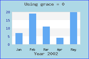
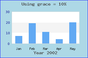
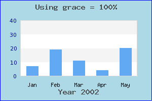
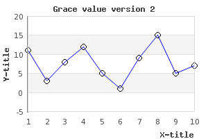
should be used. This method will adjust the autos calling algorithm by adding the specified extra "grace"at the minimum and maximum value of the scale. The grace value is specified as an integer [0,100] and specifies a percentage to add to the min and max value before the auto scaling is made. Depending on the scale step and overall scale several scale values might give the same resulting scale. For example
1 | $graph->yscale->scale->SetGrace(20,20); |
will add 20% extra values on the top and bottom values of the data series
before the auto scale is determined. The following four examples shows how this
can be used in practice. In Figure 14.32. The original graph ( a bar graph
without grace value is created. As can be seen since the scale is very tight the
labels of the individual bars are almost out of the graph plot area. In the
following three plots results of using different values for grace are
shown.grace_ex0.php)
|
|
|
|
|
|
We finish this section by noting that adding a large grace value might
sometimes make it necessary to move one or both of the axis manually. To explain
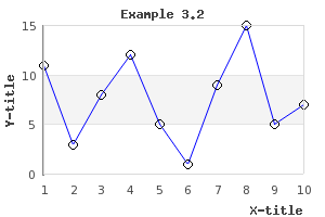
this we start with the graph in Figure 14.36. The original line graph ( example3.2.php)
as can be seen the added plot marks (see ??) are outside the boundary of the plot area and to solve this problem we add the line
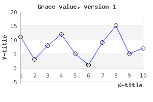
1 | $graph->yaxis->scale->SetGrace( 10 , 10 ); |
to the script. This now gives the result shown in Figure 14.37. Adding grace values. Note x-axis position at y=0 ( example3.2.1.php)
The problem is now apparent. Since the x-axis is placed at y=0 by default the x-axis is no longer at the bottom of the plot as was probably the intention. To remedy this situation we have to manually place the x-axis at the minimum y-scale position. This is done by adding the line
1 | $graph->xaxis->SetPos( 'min' ); |
to the previous script. Doing this gives us back the wanted position of the
x-axis as shown in Figure 14.38. Adjusting the position of the x-axis manually ( example3.2.2.php)
To adjust the appearance of the tick marks the following three methods can be used
-
Axis::SetTickSide($aSide)For x-axis this specifies if the tick should be drawn above or below the axis and for the y-axis it specifies if the tick marks should be on the left or on the right of the axis. Possible values of the side parameter are one of the following defines
-
SIDE_LEFT -
SIDE_RIGHT -
SIDE_TOP -
SIDE_BOTTOM
-
-
Axis::HideTicks($aHideMinor=true,$aHideMajor=true)Calling this method will make it possible to hide either noe of or both the minor or the major tick marks.
-
Axis::SetTickSize($aMajSize,$aMinSize=3)This specifies the size (in pixels) of the major and minor tick marks.
As was mentioned before it is perfectly possible to manually specify the scale labels. This is normally done for "text" scales that are most commonly used with bar graphs.
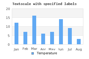
Specifying a text scale for the axis (normally the x-axis) will "reserve" a position for every data value that must be manually set. In some ways this is the same as having a linear scale with major and minor step size set to 1.
As a very basic example of a text scale with a bar graph Figure 14.40. Manual text scale with month labels ( shows some fictive values for each
month of the year. In that example the scale has been set to a text scale and
each value has been specified as an array containing all the names of the
months.manual_textscale_ex1.php)
Tip
An easy way to get hold of the names of the months is to use the library
global instance $gDateLocale of class DateLocale.
This class has several utility methods. For example the two methods
-
GetShortMonthName($aNbr) -
GetLongMonthName($aNbr)
will return the proper month names (in either short or short or long
format) in the current locale. For more details see Figure 14.40. Manual text scale with month labels (
manual_textscale_ex1.php)
Since the manual text scale sets a scale label for every single data point this would give problem for the case where we have a large number of data points where it is not possible to label every data point. In order to control this the following two methods are used
-
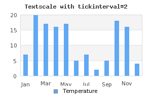
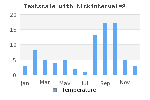
Axis::SetTextTickInterval($aStep,$aStart=0)This method controls the interval between the tick marks for a text scale. Since by default every tick will have a label it also specifies how dense the labels will be. The following examples clarifies how this works
In the above example only ever second text tick mark is set and since the labels are also placed at every tick marks only every second label are shown.
-
Axis::SetTextLabelInterval($aStep)This method complements the previous method. This method exclusively determines where the labels are place. This makes it possible to have more tick marks than labels. The previous example Figure 14.41. Setting text tick interval=2
(look a bit strange since there are no tick-marks between every second bar. A better solution in this case would be to have tick marks between each bar but only label every second tick mark. This is exactly what can be done with this method. It specifies that every n:th tick mark should have a label.manual_textscale_ex2.php)In Figure 14.42. Labels at every 2:nd tick mark
(we have used this method instead.manual_textscale_ex3.php)
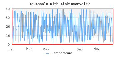
Finally we show an example where there is a need to combine the above two methods to get a reasonable looking scale. This happens when there are so many data points that it is not possible to show every tick marks. To show that text scales can also be used with other plot types than bar we have chosen to show a line graph where we show data that has 40 data points per month (480 data points per year). Let us assume that in this application we want to have tick marks at every 40 points (i.e. a total of 12 tick marks) and have labels only on every 2:th tick label (i.e. a total of 6 labels).
Caution
The label array must have labels for every tick mark even if they are not shown.
In addition to the text scale is it in principle also possible to use a manual scale with integer scale as shown in Graphing the number of sun spots during the 19th Century
Note
It is also perfectly legal to override the default labels for the Y (and Y2) axis in the same way as we have shown for the x-axis but this is probably a less used scenario.
Caution
Please note that the supplied labels will be applied to each major tick label. If there are insufficient number of supplied labels the non-existent positions will have the ordinal number of the label.
Sometimes it is a good idea to emphasize part of the scale. It can be on either the x- or the y-axis. The library offers the possibility to add a band with a separate background color for part of the scale in either x, y (or both) directions.
A plotband is defined as an instance of class PlotBand that is
added to the graph in the same way as normal plots. A plot band can have a
number of different styles to achieve the wanted affect and it can be placed
either on top or behind the plot.
An instance is created and added to the graph as shown by the following example
1 2 3 4 | // Add a horizontal band
$band = new PlotBand(HORIZONTAL,BAND_RDIAG,15,35,'khaki4');
$band->ShowFrame(false); // No border around the plot band
$graph->Add($band); |
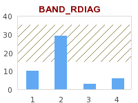
The code snippet above adds a horizontal band with a diagonal pattern (from top left to bottom right). The horizontal band is shown between the y-scale values [15,35].
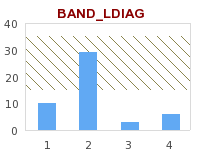
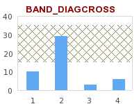
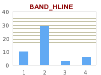
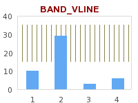
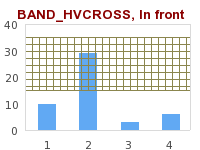
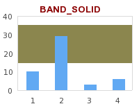
The types of plotbands supported by the library is shown in the table below
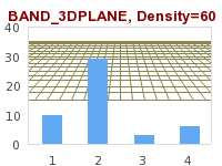
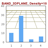
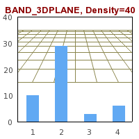
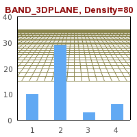
For some of these patterns it is also possible to specify an additional
density parameter via the method PlotBand::SetDensity() that
specifies how dense the pattern should be. For example Example 14.6. Different densities for various plot bands shows three variants of the 3D plane
with different density parameters.
Tip
3D planes actually carry another possible modification. You can specify the vanish point to change the perspective used. You can't access the method to change the horizon directly but you can access it through
1 | $band ->prect->SetHorizon( $aHorizon) |
assuming that the band is a 3D plane.
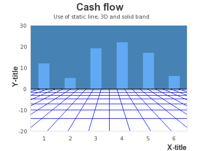
To finish this section we show one slightly more creative use of background
plot bands in Figure 14.56. Creative use of plot bands ( staticbandbarex7.php)
In addition to the plot band it is possible to add static lines to emphasize a
specific scale value. A pot line is added to the graph by creating an instance
of the class PlotLine in much the same way as for plot bands. The
following code snippets show how this can be done
1 2 3 | // Add mark graph with static lines
$line = new PlotLine(HORIZONTAL,10,"black",2);
$graph->AddLine($line); |
The above code snippets adds a black plot line (weight=2) at scale position y=10.
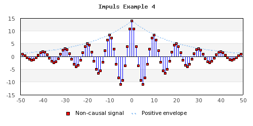
In addition to using this feature to show min/max values (or perhaps critical
limits) another usage can be to show a zero-line as the following example in
Figure 14.58. Adding a static line at y=0 to simulate an extra 0-axis ( shows.impulsex4.php)
