It is a well known fact that sun spots have a certain pattern and regularity. The cause of these regular patterns are not currently fully understood (even though investigation into this phenomenon has been made since beginning of the 17:th century). The fact that solar storms affects the earth in terms of interference with radio traffic and other sensitive electronic devices makes it very interesting to keep careful records of the suns activities.
For this reason the data of solar storm is readily available and makes an
interesting first example. The data used here is taken from SIDC (The Solar
Influences Data Analysis Center) in Belgium (http://sidc.oma.be/sunspot-data/SIDCpub.php).
In this example we will use the summary historical data that shows the total
number of sun spots per year since 1700..
The first step is to get the data into our PHP script which makes for a first good discussion since all graphs needs to get data from some source. The library itself is agnostic in regards to from where the data is collected and only needs (and requires) data stored in a PHP array of numbers (integers or floats).
In principle the data to be plotted in the graph can come from :
-
Hard-coded data in the script. This is the least flexible and can only really be recommended for examples and really static data.
-
Data stored in plain text files. (This is what we will use in this example.)
-
Data stored in binary format in flat files.
-
Data stored in a database
-
Data sent to the script via URI parameter passing (either GET or POST HTTP constructs can be used).
What is common among all these methods is that the creator of the script has to read the data into one (or several) data arrays that can be used by the library. For our example the data of sunspots are stored in a plain text file in two columns, one column for the year (with a ".5" added which indicates the average of the year) and one column for the number of sunspots for the corresponding year. As illustration the first 10 lines of data is shown in Figure 4.1. The first ten rows of data of sunspot activities from year 1700.
Figure 4.1. The first ten rows of data of sunspot activities from year 1700
1 2 3 4 5 6 7 8 9 10 | 1700.5 5.0
1701.5 11.0
1702.5 16.0
1703.5 23.0
1704.5 36.0
1705.5 58.0
1706.5 29.0
1707.5 20.0
1708.5 10.0
1709.5 8.0 |
From this data we need to create two arrays, one with the number of sunspots
and one with the corresponding years. If we assume that the data is stored in a
text file named "yearssn.txt" in the same directory as the
script file the function in Figure 4.2. Reading numeric tabulated sunspot data from a filewill read the data into two arrays
Figure 4.2. Reading numeric tabulated sunspot data from a file
1 2 3 4 5 6 7 8 9 10 11 12 13 14 15 16 17 18 | function readsunspotdata($aFile, &$aYears, &$aSunspots) { $lines = @file($aFile,FILE_IGNORE_NEW_LINES|FILE_SKIP_EMPTY_LINES); if( $lines === false ) { throw new JpGraphException('Can not read sunspot data file.'); } foreach( $lines as $line => $datarow ) { $split = preg_split('/[\s]+/',$datarow); $aYears[] = substr(trim($split[0]),0,4); $aSunspots[] = trim($split[1]); } } $year = array(); $ydata = array(); readsunspotdata('yearssn.txt',$year,$ydata); |
In the function above we have deviated from the common practice of not
including even the most basic error handling in examples by adding an exception
in case the data file could not be read. This is to emphasize that graph scripts
which reads data from potentially disconnected sources must have real quality
error and exception handling. As this is the first example we will not discuss
the details of the error handling other than saying that the library provides
one exception class JpGraphException that is meant to be used by
clients to signal unrecoverable errors in the code. The full details on error
handling in the library is discussed in Chapter 6. Error handling
Tip
In the library there is an auxiliary utility class
ReadFileData to help read data from text files. In this
class there are methods to read data from a file in either of the
following formats
-
CSV (Comma Separated Values) format.
ReadFileData::FromCSV() -
two column format (almost) as we did manually above with
ReadFileData::From2Col() -
one column format
ReadFileData::From1Col()
Armed with the data in the two arrays $year and
$ydata we will now plot the data in a basic line graph with
some variations and then show the data in a bar graph.
As the very first start we will create a line graph which shows sun spots as a line graph. To keep the code focused on the graph we do not include the previous function to read the data again in the code snippet shown below. Before we get into the code we start by briefly discuss how your script can include the necessary library files.
All graph scripts must include at least two files,
jpgraph.php and some plot module. If we want to create
a line plot we must include jpgraph_line.php. Slightly
depending on the server setup and what paths are defined for PHP include files
(as discussed in Adjusting PHP include path) the include paths for the
library might look a bit different. However, we recommend that you install the
library files so they can be accessed, for example using,
require_once('jpgraph/jpgraph.php') (since this is what is
assumed by the library examples). Furthermore, we would recommend that the
require_once() construct is used to avoid including the same
file multiple times.
1 2 3 4 5 6 7 8 9 10 11 12 13 14 15 16 17 18 19 20 21 22 23 24 25 26 27 28 29 30 | // Width and height of the graph $width = 600; $height = 200; // Create a graph instance $graph = new Graph($width,$height); // Specify what scale we want to use, // int = integer scale for the X-axis // int = integer scale for the Y-axis $graph->SetScale('intint'); // Setup a title for the graph $graph->title->Set('Sunspot example'); // Setup titles and X-axis labels $graph->xaxis->title->Set('(year from 1701)'); // Setup Y-axis title $graph->yaxis->title->Set('(# sunspots)'); // Create the linear plot $lineplot=new LinePlot($ydata); // Add the plot to the graph $graph->Add($lineplot); // Display the graph $graph->Stroke(); |
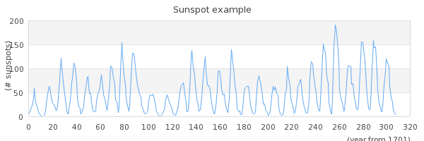
Before we explain this code in some more detail it is a good idea to visualize
what we get when we execute this as script. The result of running this script is
shown in Figure 4.3. Line plot showing the number of sun spots since 1700 ( sunspotsex1.php)
Tip
You can always click on the filename in the title of a figure to view the complete source code.
Let us now walk through this code in some details.
- Line 1-12
-
The size of the graph must always be specified so the first thing to do is to create a new graph object and set the width and height of the overall graph. All graph scripts will need to create at least one instance of the
Graph()class. By convention in all our scripts we will name the created instance of the Graph class "$graph"..The second thing that all graph scripts must specify is what kind of scales should be used. The library supports linear, integer, logarithmic, text and date scales. Since we know that our data consist of only integers we keep things simple and set both the X and the Y axis scale to be integers. The scale is specified as a string where the first half of the string denominates the X-axis scale and the second half denominates the Y-axis scale. So in our example we specify '
intint'. With this explanation you can probably guess what 'intlog' or 'linlog' would do. Why not try it ? - Line 13-21
-
These lines sets some different text labels. By the naming convention used in the library you can probably guess what all those lines are doing. They set the overall graph title as well as the X- and Y-axis titles. To keep the example as lean as possible we use the default font and default size and color of the text strings.
- Line 22-27
-
Each graph must have at least one plot (data series) that is added to the graph. In our case we wanted to create a line graph so we must create an instance of the class '
LinePlot'. We create a new instance of this class and as a parameter use the data for the data series we want to create the line plot from, in our case the data array with the sun spot numbers. - Line 29
-
Understanding this single line is key to understanding dynamic graph generation with PHP. This line instructs the library to actually create the graph as an image, encode it in the chosen image format (e.g. png, jpg, gif, etc) and stream it back to the browser with the correct header identifying the data stream that the client receives as a valid image stream. When the client (most often a browser) calls the PHP script it will return data that will make the browser think it is receiving an image and not, as you might have done up to now from PHP scripts, text.
This is something that can be conceptually difficult to fully understand at first and that is why we are spending the entire next chapter Chapter 5. Fundamentals of dynamic graph generation on further exploring this. But for now please accept that this works and by calling the script above in your browser (it is available in the "
Examples/" directory in the distribution as 'sunspotsex1.php') you should get the exact same image as shown above in Figure 4.3. Line plot showing the number of sun spots since 1700(sunspotsex1.php)
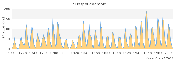
Let's now make a small variation of the above line graph. Let's make it a filled line graph. instead. In order to do this we only have to add one single line
1 2 3 | $lineplot->SetFillColor('orange@0.5'); |
The line above actually does two things. First it sets the basic color to
'orange' and then it modifies this color to be 50% opaque (0.5) which makes the
grid line shine through the fill color to some extent. The whole color handling
in the library is further describe both in Appendix D. Named color list as well as in Chapter 7. Color handling. The result of adding the line above is
shown in Figure 4.4. Displaying sun spots with a semi filled line graph ( sunspotsex2.php)
Note
This section can be skipped at first reading since it contains some slightly more advanced material. The reason why we have included this section already now is that some of the issues discussed here is an often repeated question among newcomers to the library.
There is one bit of the available data that we haven't used yet and that is the actual years. In the example above we can only see the count from 1700. (If we just want to look at the cyclic behaviour of the number of sunspots this is fine since what year a specific number of sunspots appeared is not relevant.) To make it easier to see what year corresponds to the different sunspot numbers we must change the label on the X-axis scale to show the years instead.
There is actually a couple of ways to do this. The easiest way is to just
add the labels we have ($years) on the X-axis and instruct the
library to use them instead. This is done with a call to the method
SetTickLabels() on the X-axis. This method call takes an
array as argument and uses the values in that array to populate all labels
on major tick marks. In order to make adequate room for the scale the
library automatically selects a suitable distance between each major tick
mark.
1 2 3 | $graph->xaxis->SetTickLabels($year); |
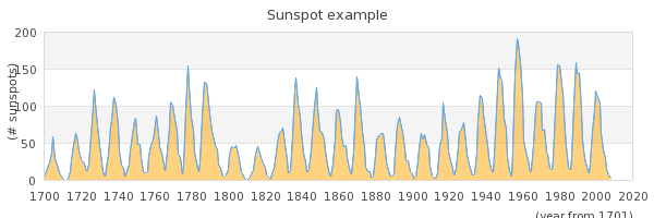
Adding this line to our previous graph will generate the graph shown in Figure 4.5. Adding tick labels to the graph ( sunspotsex3.php)
However, there is a problem in the graph above. There are valid years on the X-axis up to "2000" but then there is a single label "320".
What is going on here? Have we already discovered a bug in the library?
No, not really. In the way we have setup the graph we have not provided the library with enough labels. What has happened is that the integer scale has chosen a suitable interval between each tick label to have enough space to be able to show the labels. As can be seen from the figure the distance chosen with this particular graph seems to be 20 years between each tick. The way the default labeling works is that the end tick should be labelled and hence be an even multiple of 20 years (in this case).
Since the library needs to have tick labels for all ticks it uses the
labels we supplied as far as they go (up to 2008) but since we didn't supply
data more than up to "2008" (in the $year array) the library
does what it can do and continues with the ordinal numbers where we failed
to provide enough labels.
Now, there are a some standard ways of correcting this abomination.
-
We can set a manual scale to make sure the scale ends exactly at 2008, i.e. the scale is exactly as long as our data. This is done by submitting the wanted scale min/max as additional argument in the
SetScale()method. First the min/max for the Y-axis and then the min/max for the X-scale. Since we still want the Y-scale to be fully automatically determined we just put a "0" for both min and max on the Y-scale and specify 0 for the min x-value and then the exact number of sunspots we have measured as the maximum x-value.1 2 3
$graph->SetScale('intint',0,0,0,max($year)-min($year)+1);
The result of this is shown in Figure 4.6. Manually specifying the X scale to use just the supplied X values
(sunspotsex4.php)
-
An alternative way to get labels is to use a callback function to specify the labels. This works so that the library calls the user specified function and as argument passes the label (or the value of the label) that the library intends to put on a tick. The library will then use as the actual label whatever string value we return from our function. Since we know that the integer label 0 (the first tick) corresponds to the first value, i.e. "1700" we can simply take whatever label we get as argument, add "1700" and return that value. This way all labels will be properly named and even if the scale extends far beyond where we have data a sensible tick label will be shown.
A suitable callback function together with the method to instruct the library to use this callback would be
1 2 3 4 5 6 7 8 9 10 11 12 13 14 15
// ... // Label callback function year_callback($aLabel) { return 1700+(int)$aLabel; } // ... $graph->xaxis->SetLabelFormatCallback('year_callback'); // ...
and the result can be seen in Figure 4.7. Using a callback to get correct values on the x axis
(sunspotsex5.php)
-
There is one more way to handle this issue which we will not cover in detail yet. This is to use a "text" scale. The "text"scale can be used when there is no need to show numeric values on the axis. A typical use for text scale would be to add labels to mark bar graphs. Of course a text can contain numeric strings that would make it visually indistinguishable from a "real" numeric value.
For text scales every label counts. So by default the library will assign a tick mark for each ordinal so that every label is used. In some cases this will just be two dense and then the tick and the labelling can be adjusted by calling the two methods
Axis::SetTextTickInterval()andAxis::SetTextLabelInterval()to get to a wanted result. But for now we do not discuss this technique further here since it would bring too far.
As a final illustration we will show how easy it is to change the plot type.
We will make a small modification of the previous script and display the sun
spots as a bar graph instead. In order to do this we take the code from Figure 4.4. Displaying sun spots with a semi filled line graph ( and just change the creation of an instance
of the sunspotsex2.php)LinePlot() class to instead be an instance of the
BarPlot() class (to make the code more readable we also change
the name of the variable where we store the instance so it makes more sense). In
order to use this class we must also change the include statement so that the
bar module is included by adding the statement
require_once('jpgraph/jpgraph_barplot.php'). The changed code
would now look like this
1 2 3 4 5 6 7 8 9 10 11 12 13 | // ... // Create the bar plot $barplot=new BarPlot($ydata); // Add the plot to the graph $graph->Add($barplot); // Display the graph $graph->Stroke(); |
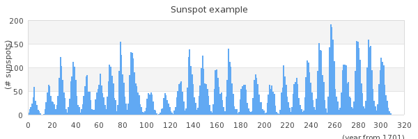
and would result in the graph displayed in Figure 4.8. Changing the plot type to a bar plot instead ( sunspotsex6.php)
Since there are so many bars in small space we cannot see the individual bars
in the example in Figure 4.8. Changing the plot type to a bar plot instead ( . So lets modify the script so that it only
shows the last 20 years of measurements so that we can see the individual bars.
To set this up there are two things we must dosunspotsex6.php)
-
Change the scale ot a text scale since we want to make sure each value is displayed. In addition the text scale actually changes one more thing that we haven't mentioned. Using a text scale also changes the alignment of the labels. For linear, integer, logarithmic scales the labels are placed cantered below the tick marks. For text labels they are instead place in between the tick marks. This is the most common way of displaying bar graphs. This is one more reason to think of text scales as a special scale mostly suitable for bar graphs.
-
Add two lines of code to "chop off" the extra not wanted data in the input data arrays.
The following code snippet shows the necessary modifications to the previous script
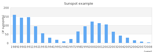
1 2 3 4 5 6 7 8 9 10 11 12 13 14 | // Just keep the last 20 values in the arrays $year = array_slice($year, -20); $ydata = array_slice($ydata, -20); // ... // Specify what scale we want to use, // text = txt scale for the X-axis // int = integer scale for the Y-axis $graph->SetScale('textint'); // ... |
The final graph with the "zoomed" last 20 years can now be seen in
Since the scale is larger we can now actually see the individual bars. By
default the library choses a light blue color to fill the interior. (Try to see
what happens if you add the method call
"$barplot->SetFillColor('orange@0.5');" just after the
"$barplot" variable has been assigned the new BarPlot
object.)
